

Credit Insights
Provide actionable credit score insights that are dynamic and tailored to user's latest credit report, helping them improve their credit score.
Impact:
Monthly views more than doubled from 282K in September to 556K in November, 2024, reaching 614K in January, 2025.
My Role
Sole Designer
Duration
1 Month
Responsibility
Product Design, Hi-fi Mockups, Prototypes
Platform
Web, iOS, Android

Market Status

User Needs
Business Needs


How might we help users better understand their credit health and drive deeper engagement?
Solution Delivered


Monthly views on web
Before
After
282k
614k

332k
118% increase
Average time spent on web credit experience
Before
After
50s
60s
10s
20% increase
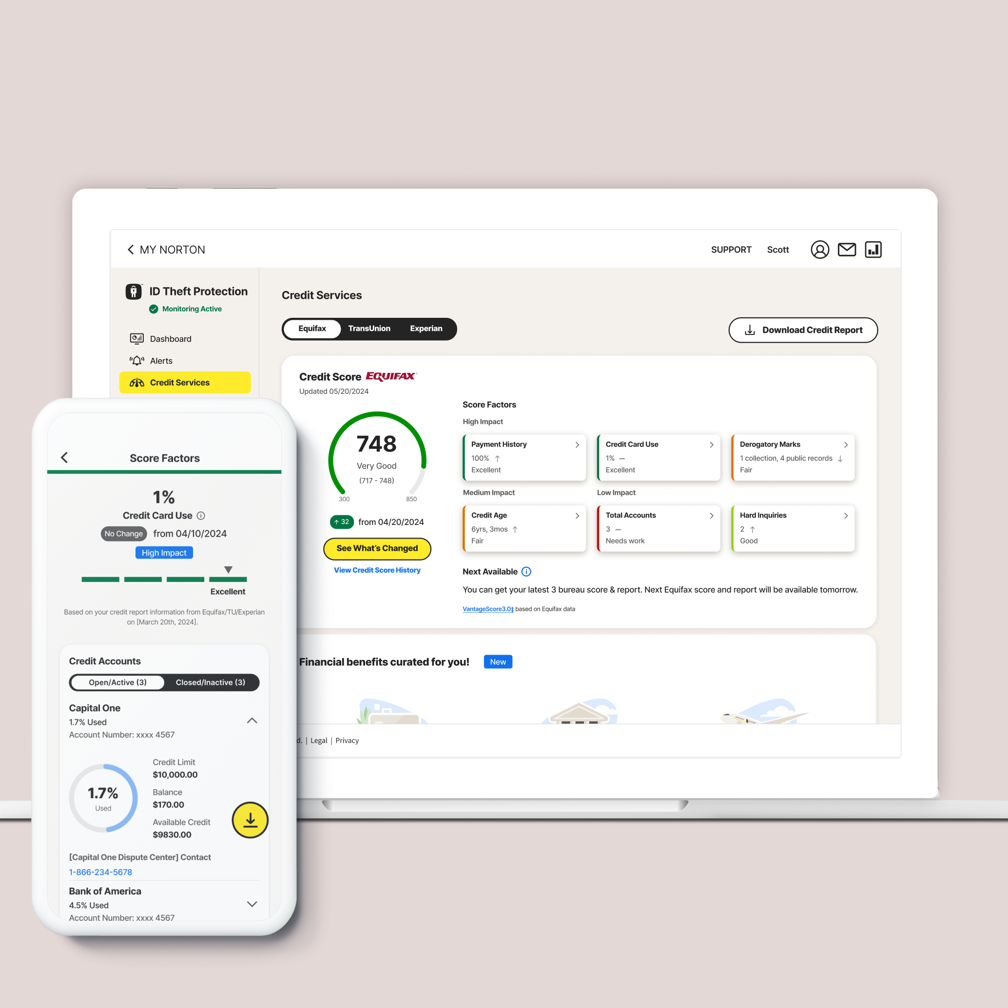
01
Factors Overview
User Goals - More valuable insights to improve score
Current Problems

Iterations

Option 1 - Information list

Lots of texts to read through;
Took up a of vertical space;
User would like to understand more about what each factor means;

Option 2 - Dynamic card

Introduced the value proposition first and encourage the user to click the CTA to see the factor change;
Divided the factors by impact so the user can easily focus on the ones that have a higher impact on their score;
User can see the value but not the change in value;
User would like to know if there is a summary listing all the changes;
One more click to see the lower impact factors;

Option 3 - Selected Layout
Introduced the value proposition first to encourage the user to click the CTA to see the factor change;
Provided high-level information on each card, including:
- Value
- Change indicator
- Rating
Color-coded the card style to match the rating;
02
Deep Dive
User Goals - Less effort to find information
After finalizing the entry point design, I began to consider how to layout the detailed information. I noticed that some of the six factors listed below have very similar details to what is already on the current credit page. How should I handle this?
Current Problems

Revised Design

Iterations

Payment History Default

Payment History Expanded

Credit Card Use Default

Credit Card Use Expanded

Derogatory Marks Expanded

Credit Age Default

Total Accounts Expanded

Hard Inquiries Default

Tooltips - help user understand how the factors get calculated
Payment History

Credit Card Use

Derogatory Marks

Credit Age

Total Accounts

Hard Inquires

03
See What's Changed
User Goals - Quickly grasp a summary of changes
On the revised layout, in addition to allowing users to click on each card to learn more about each factor's change, I also introduced a way for users to see a summary of all the changes. How should we trigger this summary view?
Iterations

Option 1
Text button has low discoverability;

Option 2 - Selected Layout
After the user clicks "Get Latest Score & Report", their attention is still focused on the left side because the score has just been updated. Placing "See What's Changed" in the same spot could easily catch their attention;
Modal Details

Current Problems

Revised Example

Other New Mocks
Payment History

Credit Card Use

Derogatory Marks

Credit Age

Total Accounts

Hard Inquiries

Personal Information

If you like what you see and want to work together, get in touch!
yanni0801@gmail.com