


LifeLock Mobile Onboarding
Create a seamless onboarding experience that bridges the gap between purchase and product usage, driving feature activation and positively impacting retention.
Impact:
3.7 - 4.6% boost in the 1st month post-purchase retention
> 2x Feature activation rate
My Role
Lead Designer
Duration
8 Months
Responsibility
User Research, Product Design, Hi-fi Mockups, Prototypes
Platform
iOS, Android
Did you know?


There's a victim of identity theft in the U.S. every 3 seconds.*
63M
More than 63M Americans have been affected by identity theft.*
$29B
Over $29B were stolen from identity theft victims in 2022.**
*Based on an online survey of 5,004 adults in the U.S. conducted by The Harris Poll on behalf of Gen™ (formerly NortonLifeLock), January 2023.
**Based on an online survey of 505 U.S. adults who experienced ID theft in 2022, conducted for Gen™ by The Harris Poll, January 2023.

Group
Adults aged 40 plus, often with families or financial responsibilities.
Behavior
Historically were web-first, but are increasingly turning to mobile.
Motivations
Concerns around fraud, credit and protection.
Core needs
Minimize financial loss, damage to credit, increase confidence and safety.

High Early Churn Post Purchase
Many users drop off early, saying they don’t see enough value to justify the cost. For high SKU members, first-month retention is 6.5% lower than second-month retention, and for low SKU members, the gap is about 12%.
“I am paying LifeLock a lot, what did I get exactly?"
Low Engagement
Key features are often underutilized. Users often don’t fully grasp the benefits or see setup as too time-consuming, which lowers perceived value and weakens long-term engagement.
“What does it do? It‘s hard to understand how to use it."


FIRST IMPRESSION MATTERS
First meaningful interaction post-purchase

BUILD EARLY TRUST
Sets the tone for confidence, protection and reassurance

A GAP WITH BIG UPSIDE
Best chance to retain new users and improve feature adoption
1.0
Purchase

User Goals - Understand plan benefits
Current Problems
PREVIOUS OVERALL FLOW

PLAN SELECTION SCREEN EXAMPLE

PAIN POINTS
Iterations
I conducted user testing on this version and gathered valuable insights to guide further iterations.
TESTED DESIGN

TESTING LEARNINGS

User appreciated the new layout for displaying annual and monthly prices together;
User liked the side-by-side comparison view and found it easy to understand the three purchase plans.

However, not all the tested user noticed the entry;
Some users didn’t realize they need to tap to expand each feature;
Some user are unsure if green dots mean available and red dots mean unavailable;
Revised Solution
I applied the insights from the research to develop the following design. These screens are currently being implemented within our In-Product Messaging framework, enabling easy A/B testing for future content adjustments.
REVISED DESIGN

DESIGN RATIONALE
Add a "Compare" button to open a contextual bottom sheet, allowing users to easily view a side-by-side comparison of the three plans;
User found the revised green check marks and red “x” are easier to understand;
Participants understand they can expand each feature to learn more;
PURCHASE FLOW DEMO

2.0
Auto-activation

User Goals - Quickly see the product value
Current Problems

No Post-purchase Guidance
After purchase, users are currently dropped directly into the dashboard.
Without clear guidance, many users remain unaware of key protections and daily updates unless they discover them on their own.
Low Feature Activation
Financial Transaction' activation rate is only 13%, impacts members' protection and monitoring capabilities.
Activation processes can be tedious and time-consuming, affecting member satisfaction and NPS.
Revised Solution
I worked with the PM to identify three core features—Insurance, Restoration, and Dark Web Monitoring—that are included across all of our SKUs. My goal was to auto-activate as many of these features as possible and visually communicate the activation process so users feel protected and empowered right away. I collaborated closely with our illustrator to brainstorm ideas, ultimately deciding to use consistent characters throughout the onboarding journey to create a cohesive and engaging experience.
User testing participants found this made them feel good that the app was protecting them immediately.
AUTO-ACTIVATION FLOW DEMO

Action Optional
There are also a couple of optional actions user need to take. I redesigned these screens and gave it more fresh and consistent look, clearly indicated the value and impact about why user can get a better protection from it. User testing participants liked how LifeLock showed them the benefits of turning on notifications and Face ID/Biometric Setup.
BEFORE

AFTER

3.0
ID Verification

User Goals - Understand how their personal info will be utilized
NAME

ADDRESS

SSN

FCRA

VERIFICATION FLOW

CELEBRATE SUCCESS

4.0
Manual Activation

User Goals - Minimize effort required
High SKU Flow
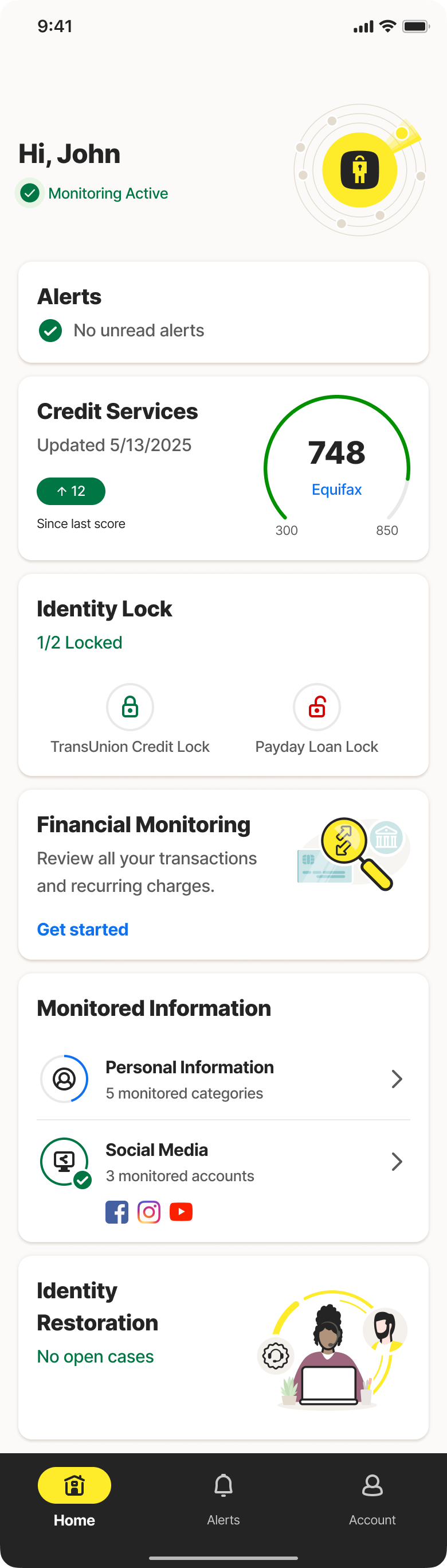
Let me walk you through how I encouraged users to turn awareness into action and drive meaningful activation. For higher-tier SKUs, we prompt users to enable key features like Credit Lock and Transaction Monitoring—two powerful features tied closely to ongoing engagement.
Credit Screen Iteration
Since we automatically pull credit information when users first join LifeLock, I present their credit score immediately to highlight our value and encourage them to enable the credit lock feature. However, feedback from user testing was not as positive as anticipated. Below is an overview of my iteration process, detailing how I addressed the insights gathered from user testing.
TESTING LEARNINGS
Participants were confused when their credit score and locks were shown simultaneously;
User doesn’t understand what is payday loan lock and would like to know more about its benefits.
Some users were wondering why it’s only TransUnion not all 3 bureaus;
Not all the tested users noticed the reminder regarding unlock;
TESTED VERSION

REVISED DESIGN

DESIGN RATIONALE
Added a transitional message to inform users that their score was located first;
Reduced the number of locks displayed, emphasizing credit locks to increase feature awareness during onboarding;
Moved the reminder message up to clarify scenarios requiring unlock;
Explained the other two bureaus within tooltip-triggered bottom sheets for additional context and understanding;
Transaction Monitoring Activation Design
After users activate the lock feature, I explain that we found their accounts from their credit report and encourage them to add accounts for monitoring financial activities. This approach minimizes the need for additional manual input.
PROPOSED DESIGN
DESIGN RATIONALE
Low SKU Flow
For all of our new users, we currently send historical dark web monitoring alerts after user purchase to indicate any historical breaches, but except alerts, we haven’t visually communicated this process to users. For those users who has lower SKU, they don’t have credit locks and transaction monitoring, I believe onboarding is a great opportunity to introduce Dark Web Monitoring feature, reinforcing our value from the start.
WITH RESULTS

NO RESULTS

5.0
Welcome

User Goals - Feel reassured
WELCOME SCREEN

HIGH SKU E2E EXPERIENCE DEMO
SCENARIO 1

SCENARIO 2

SCENARIO 3

SCENARIO 4

Credit Lock
Activation Rate
Transaction Monitoring
Activation Rate
1st Month Post Purchase
Retention Rate
BEFORE

AFTER
If you like what you see and want to work together, get in touch!
yanni0801@gmail.com